Showing posts with label book design. Show all posts

Thursday, March 12, 2015

Judging Your Book By Its Cover


Over the years, whether I realized it or not, I judged each book I read by its cover. Now it could be because on some subconscious level, my designer’s eye influences my decision  on whether or not to invest my leisurely time (which, like most of us, is precious and few) in reading a book. Sure, there may be other factors that go further to either convince or deter me, such as reading the back cover copy or the first page of the book. But it is that initial glance, that spying from the corner of my eye as I pass the book aisle that makes me stop, turn, and lift the book from its place to examine it more closely.


I like to wander in bookstores, libraries and stores with book departments to check out the latest books being displayed on the shelves. Part of why I do it is to keep up on the current book design trends. Another reason is to see if I can understand the narrative the cover design is attempting to convey. Just like the story within the book’s binding, its cover has a narrative. This narrative is created through the photos, illustrations or other design elements arranged on the book's cover. And just like imagery in a story’s narrative, a cover’s images can reflect elements of the book or serve as thematic metaphors.  The tricky part is creating enough of a (graphical) narrative to provide a glimpse into the story without overwhelming or underwhelming the reader.

When I tell someone that I design books, the conversation usually veers toward discussing a book’s cover. Most assume that book design is all about the cover. And they’d be right, on some days. (The book’s interior design doesn’t usually get to shine in the limelight, for good reasons I believe, but that’s for another post.) On some days, it’s all I can think about. I’ll even dream about a cover’s design, especially if I’m working out issues I’m having in trying to make it match the design I’d originally envisioned.

Sometimes, I’ll obsess over a book cover, because I don’t have a vision for it. I don’t normally read the book before sitting down to design its cover.  The book summary and the first couple of chapters are usually enough get the design started. But on occasion, there will be a book that defies my design sensibilities. 

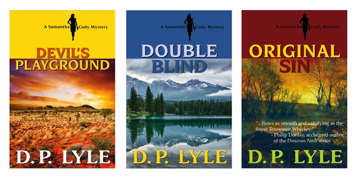
I recently put together composite covers for a three-book series that Reputation Books just acquired. I had designed another three-book series last summer and really enjoyed coming up with cover concepts, especially the series’ branding. Those books had a distinct sense of place, which is reflected on each cover. 


This time, however, I wanted to design the three books in a different style. After several days of cover design fails, I finally went wandering down the book aisles of my local Costco, and found Alan Bradley's Flavia de Luce books for sale. The contrast of colors and stark imagery made me take notice.  I liked how the covers had common elements that were used differently on each book. I couldn’t help but pick them up.  


A book cover provides a way to graphically represent the book’s tropes. Tropes are the figures of speech writers use to render meaning. We’re all familiar with tropes of comparison, such as metaphors and similes, which are used to create figurative connections in our stories. The same goes for a book cover.  But a book cover can also create metaphoric or figurative connections through principles of synecdoche and metonymy, tropes of substitution, which I think the book designer of the Flavia de Luce books does quite well. 

 As my former MFA professor explains:
“Synecdoche [is a] substitution of the part for the whole; the part stands for the whole. Synecdoche comes in several types. The genus can be substituted for the species (vessel for ship, weapon for sword, arms for rifles, vehicle for bicycle) or the species substituted for the whole (sail for ship, hands for helpers), or matter substituted for what is made from it (canvas for painting, silver for money, steel for sword). . . . Metonymy [is the] substitution of some attribute for a thing, such as crown for royalty (crown belonging to the crown), miter for bishop, pen for writer.”
Whether you are designing your own book cover or hiring a book designer, you can save some time and money, if you come prepared with a few ideas of what you’d like for your book’s cover. One way to generate ideas is to do what I do: go into bookstores and libraries and look at covers of books in the same genre as your book. When I see a cover that stands out in particular, I’ll take a picture of it with my phone. Here are some other tips in coming up with a cover design: 

  • Explore a sense of place; the right picture with the story’s setting can help to show not only where the story takes place but also imply the emotional tone of the story.
  • Look for images that can metaphorically represent themes of the story, character attribute or elements of the plot.
  • Try focused imagery or specific elements to imply a broader theme, more complete scene or larger object.
  • Consider the balance and symmetry of images, words and other design elements placed together on the cover. What pulls at your attention? How does the information – language and imagery – flow, both down and across the cover?
  • Watch out for clichés. Just like in writing, clichés occur in book design. Research other books that are in your book’s genre. Taking into account the design elements that are common to that genre, you still want to make your cover specific to your story. The problem with cliché covers is that the overused imagery often bears little or no relationship to the book’s actual content.

I think of the cover as the book’s invitation. It is the first, and sometimes last impression. It should reveal enough to whet the reader’s appetite and peak his or her curiosity.  Interpreting a book cover can sometimes seem like reading runes, but what gets it pick up off the shelf isn’t how closely it resembles the story but how well it communicates a meaningful narrative to the potential reader. 

Thursday, February 5, 2015

Do You Know Where You Are?

I was late to my first day of class. My prospects of making a good impression with the teacher decreased dramatically every time I ran up to a building only to discover that the class was no longer where it should be. The community college is a campus of buildings spread across small hills. The hills aren’t big or particularly challenging, except when you are late for a class you are hoping to add. Then it seems everywhere you go, you are either going up a hill or down one.

For the second time that morning, I climbed the steps to the student services building to get some help. This wasn’t the first time I’ve been to the campus or taken a class here, but a few years have passed, and I hardly recognized the school. Large areas, once rolling swaths of grass, were now cut up and fenced off with eight foot high cyclone fences, which gave you a sense of walking through a zoo rather than a school. Everywhere I turned seemed to be in some state of construction. A brand new fine arts building unexpectedly appeared before me. I then passed another new building, almost complete. A construction worker called down to his co-worker who yelled back over the din of jackhammers below. Students were scattered, milling around the bookstore, either reading their textbooks or talking to classmates sitting on the weathered wood benches, or gathered around the short adobe-like walls that
carved out small patches of green turf and surrounded the large oak and walnut trees.

I was told the creative writing class was in another building located in another area of the campus. This time, further east, near the parking lot, in one of the older buildings. I climbed yet another hill. Rather this time, it was concrete ramp, leading to a row of classrooms. The 70’s single story, flat-roofed building was unremarkable, except for its stark contrast to the newest building across the campus, jutting forth above the trees, like a trumpet pointing upward, as if to herald its arrival. Around the corner I heard the dripping of water and wondered, when did it rain? It didn’t. I obeyed the cautionary signs and watched my step.

By the time I reached the classroom, the right one this time, class was nearly over. My abrupt entrance interrupted the teacher, who had been in the middle of reading a poem out loud. He pushed his glasses up his nose to look at me. I recognized him immediately. I'd taken his class a number of years ago. Other than a few more wrinkles and a little more gray, he was the same as I remembered. Out of nervousness, I blurted out that I wanted to add his class.

The teacher asked, “Do you know where you are?”

I answered with a yes, but his question took me off guard. I reflexively looked around. Did I know where I was? The room was small and somewhat cramped. The L-shaped student desks were jammed so close together, there hardly seemed any space between them. A dampness clung to the air. The black built-in bookshelves on the back wall were empty, which seemed sad to me, especially for a creative writing class, but there was also a part of me that appreciated the irony of it. Writing students sat elbow to elbow, staring at me. I felt the heat rising underneath my shirt, and now wished I hadn’t grabbed the down jacket in my haste earlier that morning. 

“Do you like to read poems and short stories?” The teacher asked.

“I do.” Of course I do, I thought. I had the student loans to prove it.

“Do you like to write poems and short stories?"

“I do,” I said, except my voice wavered slightly. When was the last time I actually wrote a poem?

“First take a seat and see if by the end of the class you really want to be here.”

I took one of the seats that was off to the side, like a chair in time-out. I ended up sitting next to someone else who wanted to add the class. The teacher resumed his lesson, and I shifted into a “writerly” state of mind. I eased back against the hard, wooden chair, and listened to my classmates deconstruct a Billy Collins poem.

To be quite honest, I was back in community college, taking a writing class in order to force myself to write. It turns out I’d written more in one semester of grad school than I have in the five years after getting my MFA. My focus had since turned to publishing and my creative outlets were replaced more and more with design, mainly book design.

At the end of the class, the teacher gave me my first assignment, which was to write an edible poem or a poem with a sense of place. I chose the latter because I wrote an edible poem the last time I took the class several years ago (which you can read on Fictionaut). In trying to come up with a place to write about, I realized that one of the first things I want to know before designing a book cover is where the story is taking place. I often go into bookstores or stores with book departments to check out the latest book covers. Many books I found, especially genre fiction, evoke a sense of place on their covers.

 D.P. Lyle-Samantha Cody Mystery Book Series

A sense of place can pull you into the story and place you inside a character's point of view:
My house was at the very tip of the egg, only fifty yards from the Sound, and squeezed between two huge places that rented for twelve or fifteen thousand a season. The one on my right was a colossal affair by any standard-it was a factual imitation of some Hôtel de Ville in Normandy, with a tower on one side, spanking new under a thin beard of raw ivy, and a marble swimming pool, more than forty acres of lawn and garden. It was Gatsby’s mansion.
 -F. Scott Fitzgerald, from The Great Gatsby


Fitzgerald grounds the scene and situates the narrator with specific, concrete imagery. I’ve never been to a Hôtel de Ville in Normady, but I almost feel I’d recognize Gatsby's sprawling grounds and ostentatious mansion if I did.

Setting or a sense of place doesn’t have to be static either: 
If on leaving town you take the church road you soon will pass a glaring hill of bonywhite slabs and brown burned flowers; this is the Baptist cemetery. Our people, Talbos, Fenwicks, are buried there; my mother lies next to my father, and the graves of kinfolk, twenty or more, are around them like the prone roots of a stony tree. Below the hill grows a field of high Indian grass that changes color with the seasons; go see it in the fall, late September, when it has gone red as sunset, when scarlet shadows like firelight breeze over it and the autumn winds strum on its dry leaves sighing human music, a harp of voices.


I love the forward movement, like a camera lens moving, recording the landscape it encounters. It feels multi-dimensional and teeming with color. Capote adds texture with an element of sound. He also includes character background, history and uses direct address to pull the reader in further.

For the class assignment, I ended up writing a poem about Kauai, but as I wrote it, I wondered if readers would think it was Florida, so I narrowed the focus, bringing it down to road-level and kept moving as if the reader and I were making our way through the tropical trail, then pulling the narrative lens up for a grander sense of the place, a bird’s eye view. I even titled the poem “Bird Island.”

When I handed in the poem, I felt a sort of anxious acceptance. It has been a while since I’ve written something to share with someone else other than my cats. And it was in that moment, in that classroom with other writers reading, writing, and sharing, when I fully understood the teacher’s earlier questions. Yes, I know where I am now. I am exactly where I should be.


Monday, January 5, 2015

The Art of a Great Book


Alice and The Caterpillar by Joni Harvey-Brown

Often the time and energy and money required to produce a book is under-appreciated. The average reader imagines a scene in which the lonely writer sits atop a far-away mountain, banging away at the keyboard. The writer is often blocked by some outside force, until a flash of inspiration occurs and viola, a masterpiece! And thus the reader holds the masterpiece in their hands, quietly devouring the inked pages.

What is rarely discussed in reader circles, and even in writer circles, is the other half of the puzzle. The multitudes of people and teams that also had a hand in the work, and with whom without, that masterpiece of a book would never have reached the readers. The blood, sweat, and tears that have been shed in the process. In this modern climate of self-publishing and DIY attitudes, people often ask: what is the point of a publisher? Or an agent? Or even, an editor? 

This questioning haunts me as a literary agent. I see many writers on forums talk about agents as if we are lowly serpents trolling on the talents of writer. They spew venom about the fat-cat editors in New York (whose salary is probably barely above minimum wage). It's frustrating as no one would ask that in film. No one would ask why a script needs set-designers, or directors, or producers. As a self-published author I fully support the advent of a new publishing paradigm. But I do believe it is important to acknowledge the amount of work that it takes to produce a beautiful book whichever publishing path one chooses to take. 

I do hope this will perhaps change a few minds about the people who work in the field of publishing, because believe it or not, most of us are in this because we love books. 

The Windmill by Joni Harvey-Brown

Everyone in the literary world, from publishers, agents, editors, designers, and writers are all working toward the same goal; to produce a good book. No, to produce a great book. A book that shines on the shelf, calls out to potential readers. A book that captures you with its first sentence, whose story draws you in, and whose plot keeps you up all night reading. A book that makes you excited, anxious, and sad as the amount of pages left gets slimmer and slimmer. A book that makes you sigh with satisfaction with its last sentence. A great book.

The writer spends late nights and early mornings to create a story out of 80,000 words. They edit those words for months. Their beta-readers critique it, each comment a stab to the heart, but the writer bravely endures and edits it again, and again, and again. Then months to years later, when they have what they believe to be a finished project, they send it out to the terrifying gatekeepers, the agents.

The agents read hundreds of email queries, tens of writing samples, 2-5 manuscripts a week. They endure angry authors-rejected suitors and demanding writers whom feel they deserve the agent’s time over all else. They read through the slush of manuscripts, the wanna-be bestsellers, the overwritten literary prose, the un-edited sloppy writing to find that gleam, that rough gem that catches their attention. They find out if the gem is available, comb through it and ask for edits. They edit the second draft, and the third, and the fourth. Finally they take the gem, which now sparkles, and send it out to the impossible judges, the editors. Editors with whom they have spent years developing relationships with, learning their likes and dislikes, so that one day when the right ms for the right editor comes along, they know exactly who to send it to.

The editors slough through the agent queries, requesting too many manuscripts. Their desks are piled with submissions, with current manuscripts, and with books they need to read. They read and read and read. They find a book they want to sign, fight over it with other editors, capture it for their own. They deal with demands of the overbearing agents, and with stubborn, pretentious, or diva authors. They work under deadline from the publisher, the pressure always on. They edit, and edit, and edit some more. Finally it is ready to go to design production.

The designer keeps an eye on every book that gets released, they keep tabs on design trends, they know if Lucinda Grande has gone out of style and that vertical stripes are serious but horizontal are playful. They read the manuscript and have a brilliant concept for the cover. They create a first proof of the cover. They love the cover. The next time they look at it, they hate it. They redesign the font, change the image, adjust the hues. They tweak something a centimeter to the left, something else a half inch up. That one shape should be circular. And blue. No, cobalt blue. They create something beautiful. The author wants something else, the agent doesn’t like it, the editor thinks it’s okay, the publisher doesn’t care. They tweak it some more. This time it is perfect.

The publisher gathers the items needed to publish the book. The ISBN number, the Library of Congress data, the copyright, the price, the mega data, the whole sale price, the royalties, the contracts, the marketing copy, the distribution, the costs of production, the marketing and promotion. They work with book buyers and book stores to get the final book out there on the digital or physical bookshelf. The final push so the book is out there, a book that shines, a book that calls out to potential readers.

And all of these people take a deep collective breath and hope that they have given the potential buyer something special.

A great book.

Pandora's Box by Joni Harvey-Brown

Follow Mary for more publishing tips and talks @Mary_C_Moore 
and find out more about her writing at marycmoore.com.